By: Andrew Bermudez
(LEGO Studios; July 11, 2014)
As filming for Johnny Thunder and the Wisdom of the Ancients comes to a close, we are happy to bring you another Archive Collections, this one being full of concept art! This time, you will not only learn about our characters, but how artistic designs change over the course of a production! Let's get started!
Whenever working on any production, whether it be live action or animated, a certain amount of concept art is needed to aid in creating the feel of the production. The main reason concept art is created is to help visually convey the artist's view of how the film should look, all within the art director's discretion, of course. Because of this, changes in designs are bound to occur. This is especially true for characters, which are constantly seeing a shift in design. So, in chronological order, here are pieces of concept art for Mustache Maniacs Film Co. characters!
 |
| Pencil and color pencil on newsprint paper; by Andrew Bermudez |
 |
| Pencil and color pencil on newsprint paper; by Andrew Bermudez |
 |
| Pencil and color pencil on newsprint paper; by Andrew Bermudez |
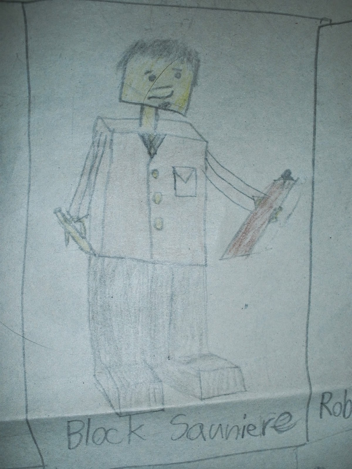
First up are a selection of character designs from Johnny Thunder and the Secret of Marco Polo. These particular designs show how these particular characters changed drastically over the course of the film's pre-production phase, especially in the case of Block Sauniere. Other character details that were changed later included Robert Teabing's torso and the color of Mao Zedong III's uniform. By the way, if you are curious about those creases in the paper, don't be alarmed. The artwork is so large, it has to be folded for storage reasons.
 |
| Pencil and color pencil on newsprint paper; by Andrew Bermudez |
 |
| Pencil and color pencil on newsprint paper; by Andrew Bermudez |
 |
| Pencil and color pencil on newsprint paper; by Andrew Bermudez |
Up next is a selection of characters from Johnny Thunder and the Gift of the Nile, some of which actually stayed pretty much the same, especially Hiram Aziz (only his fedora changed color). In this set of concept art, more emphasis was put on each character acting with props tailored to that character's profession. So Hiram holds a scroll, the Preserver uses a magnifying glass, and Said carries a serving tray. Again, just like Block Sauniere, the Preserver was drastically changed over the course of pre-production.
 |
| Pencil on paper; by Andrew Bermudez |
 |
| Pencil on paper; by Andrew Bermudez |
As we started to create traditional animation, more emphasis was placed on concept art, including these turnarounds created for Freddy and Joey. This time, since we were not restricted to minifigures, we were able to better play around with character designs, especially ranging into the realm of animal characters. While only character designs for the five characters seen between Freddy and Joey Teaser and Freddy and Joey in Corn Farm exist, plans called for a whole host of characters; thumbnails actually exist for a fox named Frank the Fox. By the way, Farmer John's hands are darker than the rest of his design because that was an alteration added later by the art director.
 |
| Pencil and colored pencil on paper; by Raul Flores |
This piece of concept art features character designs for what may be Mustache Maniacs Film Co.'s rudest family. Appearing in An Afternoon at the Zoo, this sketch shows how Raul was able to work the nasty mannerisms of these characters into their designs, with such features as large noses, large and blubber-like bodies, and over-sized hands. This is certainly one family you wouldn't want to spend a day with!
 |
| Pencil and colored pencil on Bristol paper; by Andrew Bermudez |
Returning to stop-motion animation, here are three concept thumbnails for characters from our most popular film, Forest of Fear. While concept art exists for many characters for this production, this is the only one that has characters that made it into the final film. Just like the character designs for Johnny Thunder and the Gift of the Nile, this artwork shows characters in action with props relevant to that character. For example, Torgo has a serving tray with a bottle of blood for his master, Count Werdna, and a staff with a hand carving on top.
 |
| Pencil and colored pencil on paper; by Andrew Bermudez |
Sometimes, a script calls for costume changes, so character designs must be made accordingly. This issue was encountered when designing Ralph Vagabond, the world's worst criminal, for Seeing Eye Robber. In the script, Ralph usually wears a ski mask over his face, except when he's at home. There, you briefly see his exposed face. However, as brief as that scene may be, his character had to be designed without the ski mask, but with an indication that he wears the ski mask. Therefore, in this turnaround, he holds his ski mask in his right hand. If you also notice, his head is slightly up-turned in this turnaround to make him look over-confident.
 |
| Pencil on paper; by Andrew Bermudez |
 |
| Pencil on paper; by Andrew Bermudez |
No matter how big or small a character is, designing it to make sure it evokes the proper emotional response is crucial. Shown here are two character designs for two very different, but still very appealing, characters of great size difference for Gone Ice Fishin'. This comparison also shows the main purpose for the lines in the character turnarounds: they designate size difference between characters. In this way, the animators know how big each character needs to be in each scene in relation to both the other characters and the surrounding environment.
 |
| Cut paper mounted on card stock; by Andrew Bermudez |
 |
| Cut paper mounted on card stock; by Andrew Bermudez |
 |
| Cut paper mounted on card stock; by Andrew Bermudez |
As mentioned before, characters go through multiple versions before the art director confirms the final design to be used. These three versions of Willie Swipe for Night Guard were actually created using torn paper arranged into possible character designs. In the case of this character, because the story calls for a thief, there are certain attributes that are found in all three designs, including a bean hat and a sack to store stolen goods. Eventually, the top version was picked because of his high contrast to Col. Bow Wow.
 |
| Pencil on paper; by Andrew Bermudez |
 |
| Pencil on paper; by Andrew Bermudez |
However, just because artwork exists for a film does not mean that its production is guaranteed. A prime example is The Hit Man, a never-realized animated film that started pre-production in the fall of 2012. These two characters, Juniper and Tim, show the strong contrast that the film was going to have. One is tall, one is short; one is fat, one is thin; one is threatening, one is vulnerable, and so forth. This contrast actually is very important in animation, as it allows the audience to quickly and easily understand who is who and what position they hold in the story.
 |
| Pencil, colored pencil, and marker on paper; by Raul Flores |
 |
| Pencil and colored pencil on paper; by Raul Flores |
Of course, no discussion of Mustache Maniacs Film Co. characters is complete without discussing the award-winning New Friends ~ An Environmental Fable. The artwork here shows how this film was going to go in a more realistic direction. Actually, the film was originally going to be very cartoonish, but was ridiculed by the producers for being insulting towards indigenous tribes of Oceania and the Indian Ocean. This more realistic direction is still evident in the finished film, but only in the humans, like the design shown here for Father Juniper, Mathias the Fat Chef, and Old Salt. The dodos were made cuter because the design here was deemed too unsympathetic.
 |
| Digital paint; by Melanie Modesti |
 |
| Digital paint; by Christine Kurt |
For A Bite of MyJobs, the development process stayed the same, even though the circumstances changed drastically. While the Career Advisor stayed generally the same, Dracula changed drastically in his character design. In the concept art here, you can even see three versions of Dracula's head shape, none of which were actually used in the finished film.
 |
| Pencil and colored pencil on paper; by Andrew Bermudez |
As Johnny Thunder gets ready to return for more action starting August 22, here are character designs for Johnny Thunder and the Wisdom of the Ancients. This time, the designs were for costume changes, as many occur in the film. Mysteriously, the design for jungle outfit Lance Spears was never colored.
 |
| Pencil and colored pencil on paper; by Andrew Bermudez |
 |
| Pencil and colored pencil on paper; by Andrew Bermudez |
Just for fun, here are some character designs for some of our current projects: LEGO Island: The Animated Series and Attack of the Fifty-Foot Hamster. In both pieces, the designs also exemplify the characters' personalities, with the above piece showing something interesting about our LEGO Island-based Flash-animated series: it will feature characters from all three games. The bottom piece also features the traditionally-animated character Nana translated into a minifigure.
As time goes on, characters for on-going productions will be revised, finalized, and put through production. This just goes to show how productions change. Thank you for reading, and join us soon for the next Archive Collections!
Previously:


Comments
Post a Comment